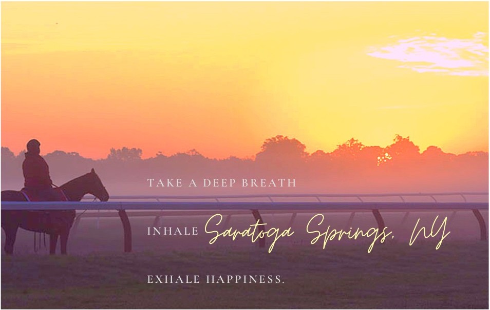
In the fast-paced world of emails, texts and tweets, sending postcards seems a little outdated. But in Saratoga Springs, the past is part of our present—just look at our historic racetrack, homes and downtown. So Saratoga Living called on local graphic designers, artists and photographers to create the perfect Saratoga postcard, one that would make would-be tourists pull out a pen on the fly, scribble a handwritten note and run to the post office to send a message the old-fashioned way. Here are a handful of our favorite submissions:
 Most Historic
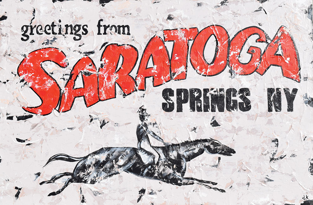
Name: David Keenan
Company: David Keenan
Instagram: @davidkeenan33
Medium: Acrylic paint and gesso on canvas
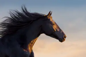
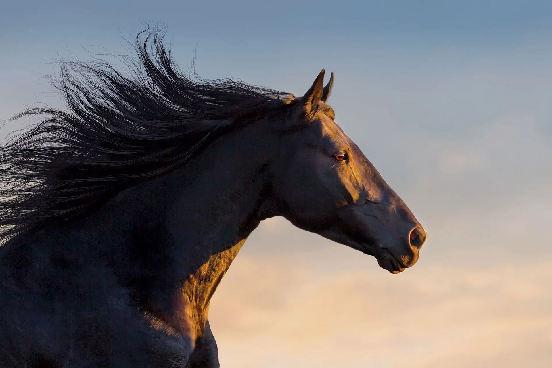
Inspiration: “I have been incorporating type into my artwork for a couple of years now. With my desire to show some history of Saratoga, I went with a vintage weathered and aged look to the postcard. Having an equine figure was a must as well.”
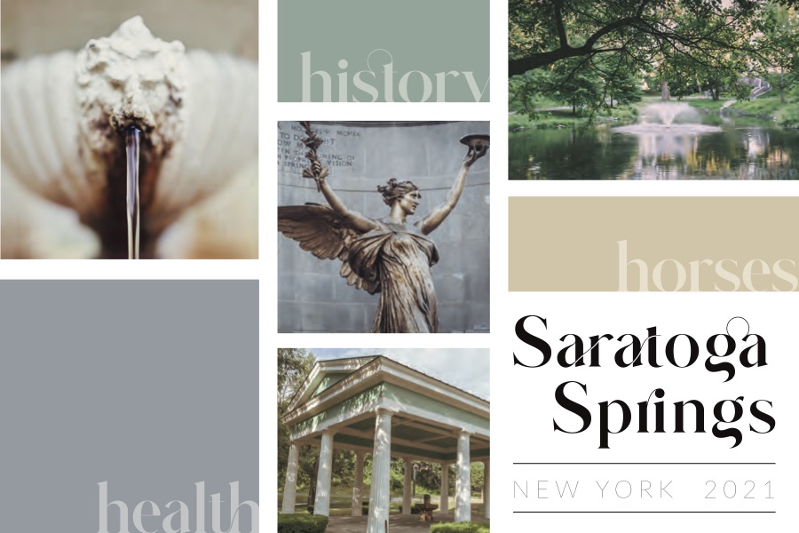
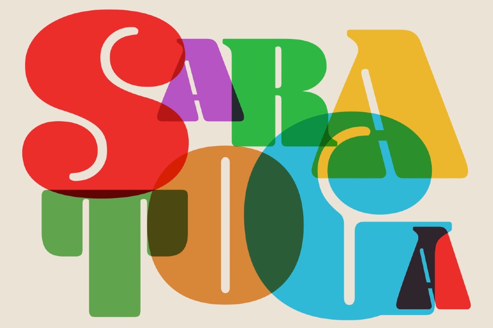
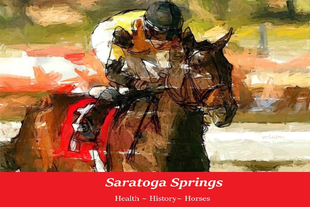
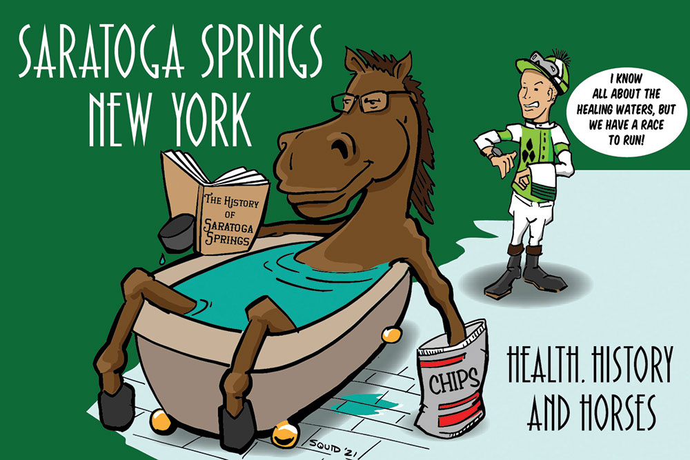 Most Creative
Name: Mark “Squid” Jewell
Company: Squid’s Lines
Instagram: @squidslines
Medium: Hand drawn and then finished in Adobe Illustrator
Inspiration: “I felt a postcard for Saratoga needed to embody the three H’s: health, history and horses.”
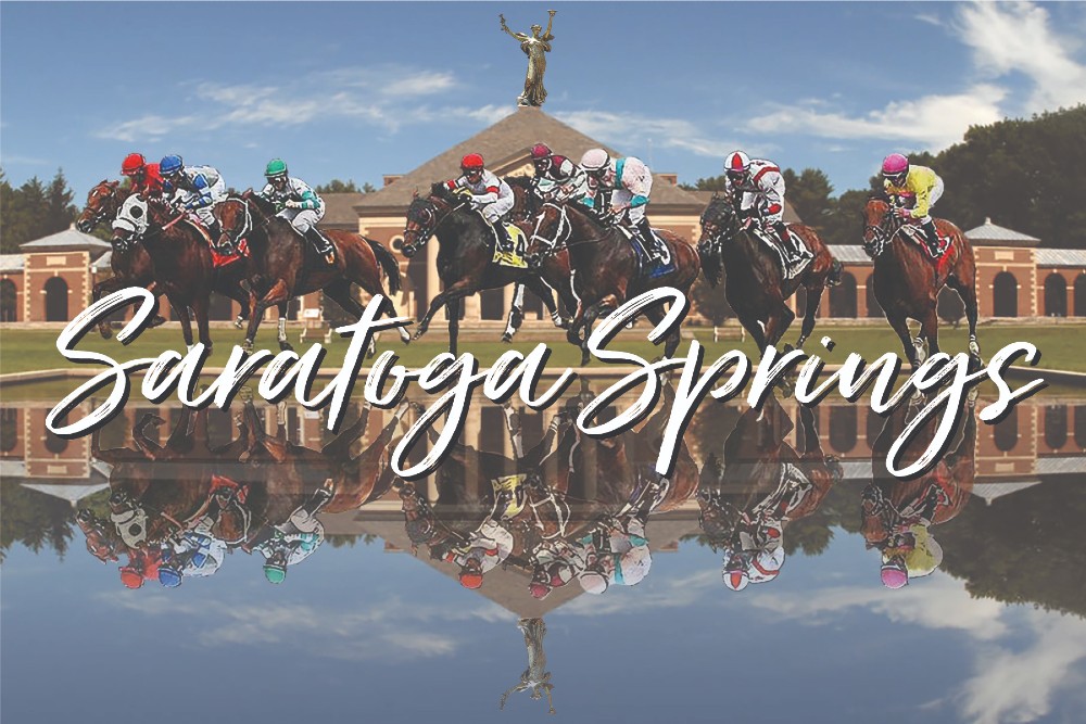
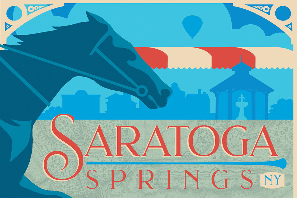
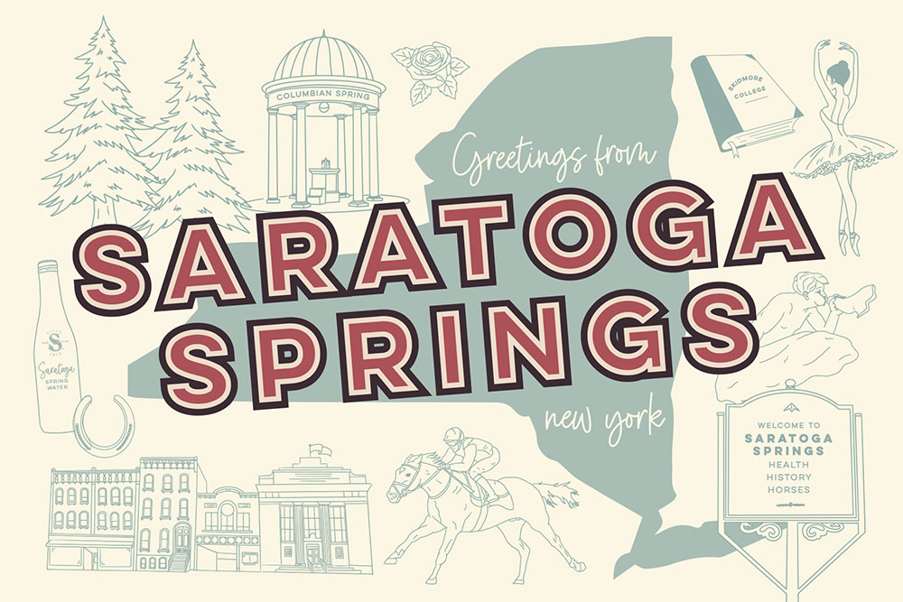 Best Depiction of Saratoga
Name: Alyssa Menshausen
Company: Pine and Park Designs
Instagram: @pine.and.park
Medium: Graphic illustration
Inspiration: “I’m a mixed media artist with backgrounds in graphic design as well as fine art (painting and drawing). Most of my drawings are done in ink, but recently, I’ve been exploring drawing digitally. This was my first swing at it; I just started doodling all that makes Saratoga a wonderful place to live and visit!”
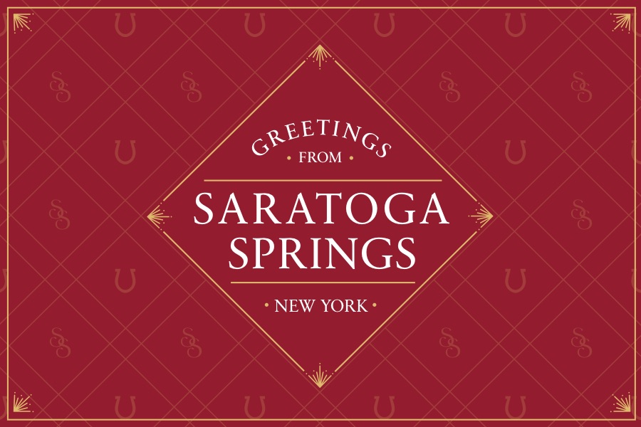
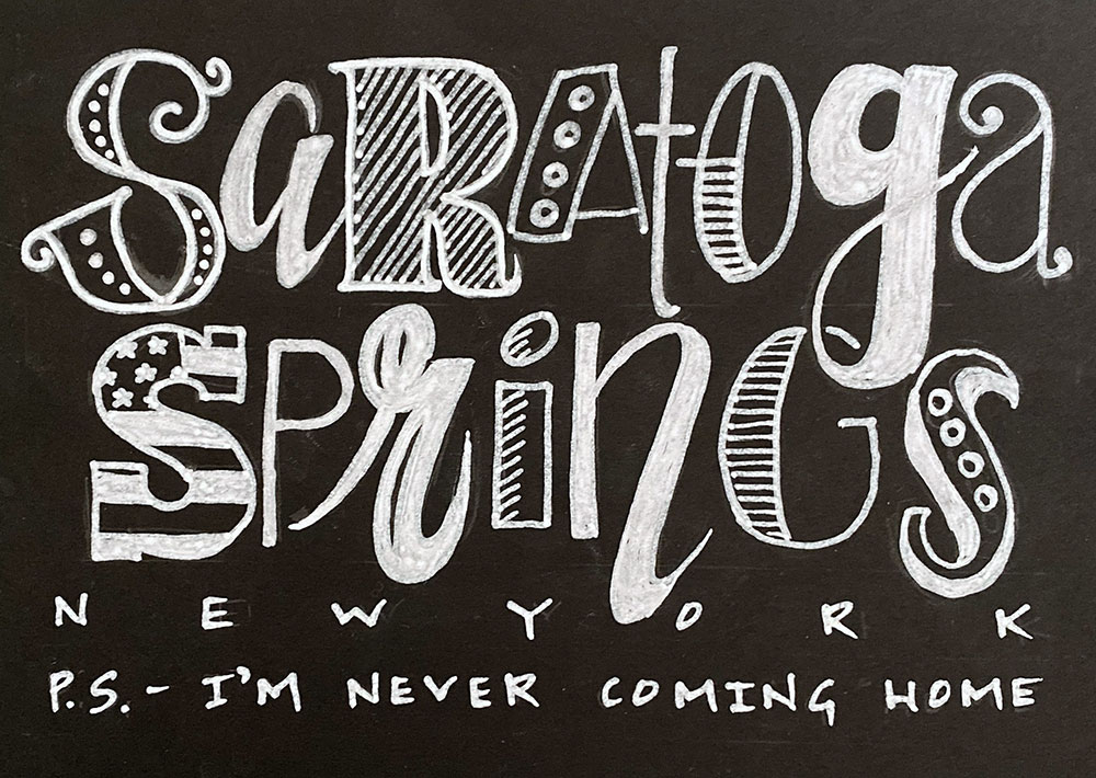 Most Modern
Name: Alli Ferraro
Company: chalked by alli
Instagram: @chalkedbyalli
Medium: Chalk pen on black cardstock
Inspiration: “I am a photographer and chalkboard artist with a growing clientele in the restaurant business here in Saratoga Springs. I drew my inspiration using fonts from various chalkboards that I have created for local businesses over the past few years. I wanted to create a ‘ransom note’ feel, as if the sender were being held hostage by this beautiful and charming city…and might never actually want to come home! I also chose white on black to mimic the chalkboard look and reflect my typical medium.”
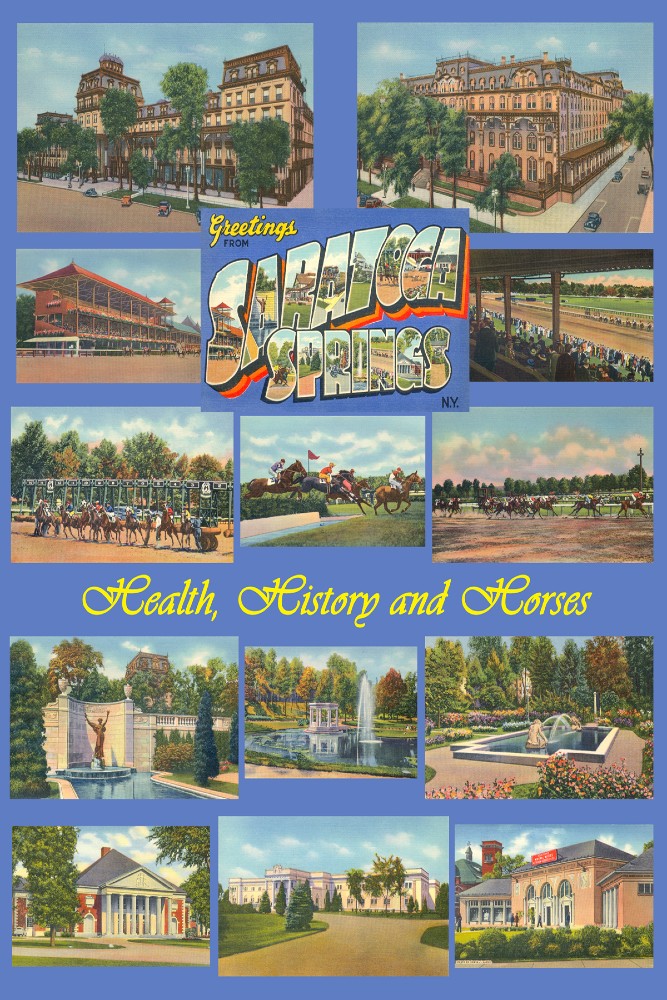
 Best In Show
Name: Barbara Kaiser
Company: Far Flying Design
Medium: Graphic illustration
Inspiration: “During a time when connection is more meaningful than ever, thoughts of friendship and fun in Saratoga Springs inspired me to try to capture a ‘happy place’ vibe in a colorful vintage style. Incorporating some of the many reasons to love the city was another focus: horse racing, history, architecture, natural beauty and of course, the springs!”
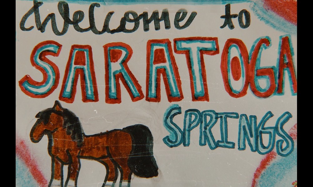 Honorable Mention
Name: Maddie Reinoehl
Age: 11
Medium: Gel markers
Inspiration: “What inspired me to draw the postcard is that I have been going to Saratoga since I was a baby. My family has owned several horses, and spent time at the track. I guess I just pieced it together based on my memories.”
And now, for more postcard design submissions…