When I was asked to write this article about 20 years of interior design in Saratoga Springs, my mind immediately traveled back to a glorious time in my life: my twenties. I got my first job then, toured wine country on the back of a BMW motorcycle, traveled with a healthy spending account and learned how to drive on the Santa Monica Piers (at night, big mistake). My design mentors included Ralph Lauren, Calvin Klein, Doug Tompkins and Giorgio Armani and, in 1998, I actually worked for Calvin on Madison Avenue in Manhattan. It was pre-kids and pre-Saratoga. What a time to be young, excited and alive!
It was in New York City that I was first introduced to Calvin’s classic and clean aesthetic. At the time, interiors were filled with faux sponge-wall finishes, wallpaper with borders and plastic ivy. Beige was at its all-time high, floral patterns showed up on oversized chairs and wall stencils prevailed. Thankfully, I skipped the era’s design misses and moved right into the early aughts, a time of Tuscan kitchens, shabby chicness and DIY everything. A few years into the 2000s, I started peeling off yesterday’s wallpaper and replacing it with cream, then taupe, then gray walls, removing shiny brass door fixtures, opting instead for oil-rubbed bronze, then polished nickel everything. I ended my love affair with antiqued cream kitchens, which I replaced with bright white cabinets, rich, dark-stained floors and minimal decor.
I arrived in Saratoga in the fall of 2006. My son TJ was just starting kindergarten, and my other son, Josh, was in preschool. I brought my design business here, and my new clients were intrigued by the clean lines, mix of textures and directional thinking I’d brought from Manhattan. It was out with the old decade and in with the new one, a time of open floor plans, authentic elements and custom finishes. Four years later, a clean, classic look inspired everything I did. Big stainless-steel appliances replaced white (and worse, black) ones, marble and quartz started to push out granite (thank you) and powerful industrial faucets popped up in classic white kitchens with large, dark-stained islands. Small dark rooms were replaced by big, open, bright ones, and we chipped away square tile, opting instead for the subway type everywhere. Saratoga was ready for a new look and the homes evolved beautifully as we shed the outdated, tossed the ivy and removed the clutter.
Then, with a nod to the past, we gave up the dining and living rooms, realizing that we were assigning too large a percentage of real estate to rooms that were seldom used. Living rooms became family rooms and were suddenly comfortable and lived-in, rather than perfect and stuffy; dining rooms became open kitchens with farm tables, and our love affair with open floor-planned homes was born. The kitchen became the new center of the house, and everything happened around large islands. At the same time, as life became more hectic, with technology affecting everything we did, interior design became more grounded, and we turned to a more organic feel, with rich, natural colors of the earth, fruits and vegetables, live wood edges and authentic finishes. Recycling was also in vogue, and with it came a focus on reusing furniture. So we’d see old pieces cleaned, painted and given a new spot. It was all about moving forward quickly while trying to stand still. So much can happen in 20 years if you want it to. And we wanted it to.
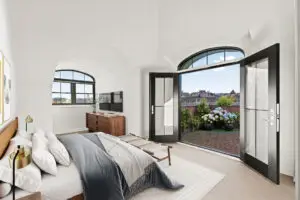
Here are some interior design trends that helped define the last 20 years in Saratoga and beyond (find each of the design trends in the accompanying photo gallery above).
Tuscan Kitchens And Large Stainless-Steel Appliances
Featuring weathered surfaces, natural textures and warm colors, Tuscan kitchens—often combined with rustic beams, stone and arched entries—mixed warmth with a new look in the late 1990s to early 2000s. Replacing Formica counters, boring oak cabinetry and bright brass hardware, this new look with black iron fixtures, oil-rubbed bronze hardware, large stainless-steel appliances and large farmhouse islands simultaneously felt collected and sophisticated.
Vessel Sinks, Plaster Walls, Modern Lights And Organic Wood
Everybody wanted vessel sinks in the early aughts. They sat on the counter rather than being dropped in or mounted below it. Coupled with plaster walls, warm, natural wood and a rough textured stone floor, this look was all about getting away from oversized vanities, opting instead for beautiful, organic natural lines, warm colors and modern light fixtures.
Creamy Walls, Rustic, Reclaimed Beams, Dark-Stained Floors And Minimal Decor
As we moved into the mid 2000s, we abandoned warm colors for a cooler, more modern palette. Creamy and taupe walls replaced sun-drenched warmth, and reclaimed wood beams showed up next to modern decor. It was a time of exploration and taking chances.
Creamy White Cabinets, Industrial Appliances And Soapstone Counters
By 2010, kitchens lightened up to a creamy white, appliances got bigger and stronger, sporting an industrial air, and natural stone became the norm. Soapstone, quartz and marble, with their soft-honed finish, replaced shiny granite, with oil-rubbed bronze hardware and minimal decor remaining the choice for designers.
Bright White Cabinets And Farmhouse Sinks
In the late 2000s, white kitchens were a classic and clean escape from a hectic life, and farmhouse sinks reminded us of a simpler time (even when they were imported from England and quite expensive). Honed marble counters were soft, natural and light. Our lives were frenetic, and a clean, bright, light and clear kitchen became a respite from it all.
Subway Tile, Taupe Walls, Cement Sinks And Large, Rectangular Floor Tile
Throughout the last 20 years, we’ve moved away from square tile—and in the last five, moved to a more classic-but-rectangular subway shape, often in cool taupe and gray tones. Coupled with a poured-cement sink and polished nickel fittings, the modern bathroom layout reflects the simplicity and the organic warmth of where interior design is now.


