In our 2025 profile on Saratoga’s Rushdown Studios, we began by looking at the systems working behind games, then expanded into the visual work players encounter on screen. Andy Polidore described building a team that creates designs, mock-ups, and art, as well as implementing them inside games. The move brought appearance and interaction into their work.
That explanation distinguishes how a game looks from how it works. Roulette offers a familiar way to examine the relationship. Its physical table brings a numbered wheel and a marked layout together. Moving them onto a screen preserves recognisable parts of the game, but the game mechanics will still need to be implemented separately.
The wheel and layout do different jobs
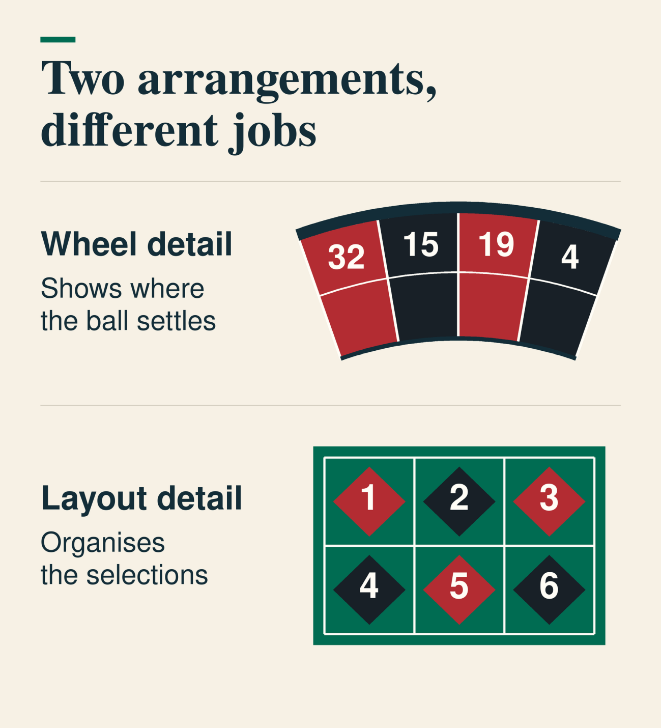
How the visuals are implemented also can make a big difference to the gameplay. An Australian-facing version of online roulette features separate screens for the wheel and betting layout. Each component retains a different function: the wheel displays where the ball settles, while the layout organises the bets that were placed.
As with a physical roulette table, the wheel half places its numbered pockets in a circular sequence, while the layout arranges numbers in a grid with marked groupings. A wheel pocket and its corresponding selection share a number, although their neighbours differ due to the different approaches. The seemingly arbitrary numbering system on the wheel might feel like a strange choice at first glance, but it’s left over from the early days of physical roulette, where it could help account for small imperfections in the balancing of the wheel, while the betting layout was designed to be as simple and compact as possible to ensure that anyone looking to place a bet could find the number they wanted easily.
These days, it’s less important that the roulette wheel has its numbers in such an odd order, especially in digital versions, but it remains a trait from the early versions. Besides, there is something quite appealing about the chaotic ordering chosen. It’s definitely more interesting than just listing the numbers in ascending order on the wheel.
Adaptation can add something to the original
The digital adaptation of Frosthaven shows how translating a physical game also involves decisions about introduction and representation. In a 2025 interview about adapting Frosthaven, developers Julian Gollop and Hristo Petkov described an introductory adventure created with the original game’s designer, Isaac Childres. Petkov said it contained four missions and a simplified version of one of the game’s phases. The introduction gave the adaptation material beyond a reproduction of its boards, cards, and figures.
Artists also created representations for things and characters that had lacked them in the tabletop game, Petkov explained. That work gave visible form to parts of an existing world. Gollop acknowledged a different consequence of the change: tabletop players could miss the physicality of the original and the proximity of people gathered together. The team worked from an established game design while giving more of its world a visible form.
The introductory adventure concerned how the game begins; the new representations concerned what its world looks like. Those choices went beyond transferring images of physical components to a screen.
Roulette starts with established appearances for both its wheel and its layout. Their digital representation draws on objects with defined forms and functions. Changes to their arrangement concern how those existing elements are presented, rather than creating an appearance for something the physical game left unseen.
Familiar forms need clear meanings
Game interface designer Hadjoudj Idris examines screen design through the difference between artwork and information. In his discussion of game interface palettes, he argues that colour should carry consistent meanings, supported by shape, position, icons, and labels. His concern is the information a player can read from those choices.
For roulette, those additional cues are already part of the physical reference: numbered pockets, marked spaces, and defined groups. Carrying them onto a display preserves that information. The game’s familiar shape establishes what is being shown; the labelled layout establishes the relationships between the available selections. Both remain relevant when that layout occupies a view of its own.
Decorative changes and informational changes have different consequences. Including details such as the grain of the wood or weave of the fabric contributes to the overall aesthetic, but it doesn’t provide the player with any information relevant to the game. Conversely, ensuring that your font is clear and that there is no risk of a player mistaking one number for another plays an important role in the game. Both aspects are important, but developers creating a digital version of a physical game should always prioritise the visual aspects that could have a direct impact on the player’s choices or the gameplay and only focus on the aesthetic details once that has been perfected.